top of page
Teafference
2021
Awards
Led the full process from product design planning to mass production
Description
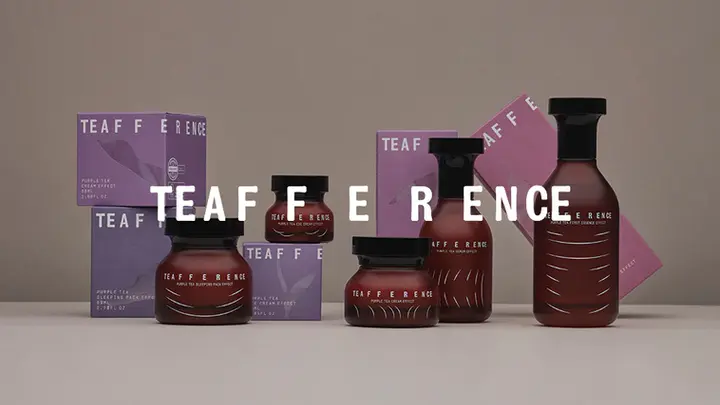
'Purple tea' leaves near the equator evolved from green to violet to protect themselves from the hot sun. It is a cosmetic container design that embodies the noble vitality of purple tea leaves blooming. Purple tea vitality, brand confidence, and sustainable philosophy were expressed through the Teafference design.
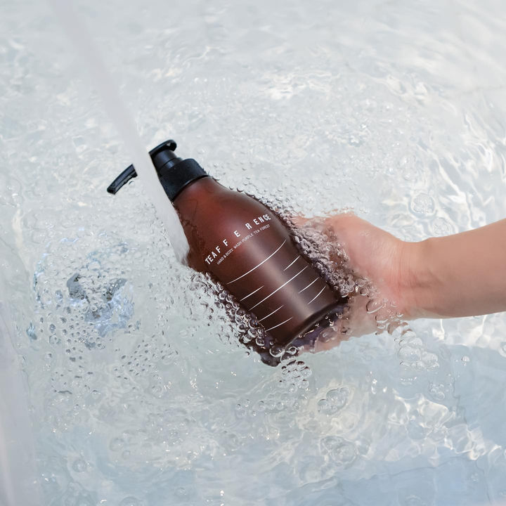
The vitality of the purple tea is captured in a geometric silhouette that spreads upwards with smooth curves. The stamped-like lid with the engraving brand's signature expresses the confidence and pride of the product quality. Teafference's brand attitude is to benefit the world with a cup of tea. Teafference containers are reused again and again. Brown glass bottles and eco-friendly plastic lid make it 100% recyclable. Green and brown are the only glass colors, recyclable 100% in the world.
Teafference logo expresses the appearance of purple tea leaves spreading out and moving on the water. It contains the image of a relaxed and pure tea. We interpret the flow of tea leaves and water as line art, which is a brand signature graphic. Teafference design provides a relaxing tea time on the dressing table.
Project
Cosmetic Product Identity Design
Client
ISOI

Other Projects
LG Mobile Refrigerator
View Project

KY Entertainment CI Design
View Project

bottom of page


